How to Add a Popup Button That Opens Your Form
What Popup Mode Does
Popup mode puts a button on your page. When a visitor clicks it, your form opens in an overlay on top of the page, so the form takes no room until someone wants it. It suits "Contact us", "Register now", "Request a quote" and "Join the waitlist" buttons in headers, banners and pricing tables.
Popup mode needs one line of code and no iframe. The same BeeForm script that resizes embedded forms builds the button and the overlay for you.
Get the Popup Code
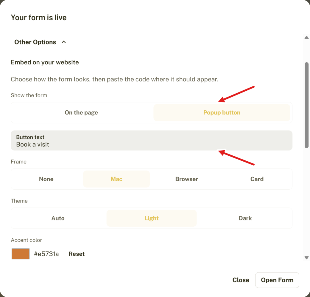
- Open the form, click Publish (or Published) and click Other options.
- Set Show the form to Popup button.
- Type the Button text.
- Choose a Frame, Theme, Accent color and Corner radius if you want. The preview shows your button and a sample of the form.
- Click Copy embed code.
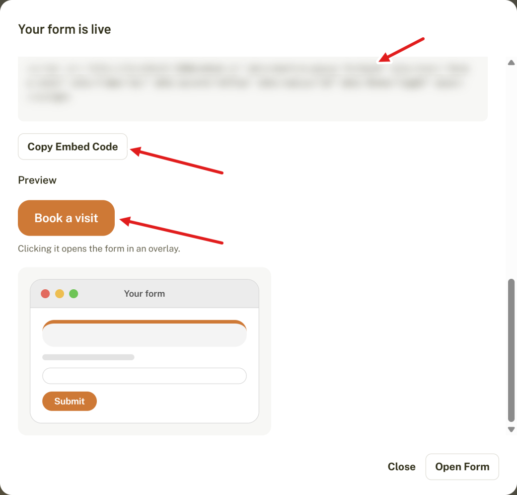
The code is a single script line. YOUR-LINK-ID is the last part of your form's share link.
<script src="https://beeform.co/embed.js" data-beeform-popup="YOUR-LINK-ID" data-label="Register now" async></script>Paste it into an HTML or code block, at the place where you want the button to appear.
How It Works for Visitors
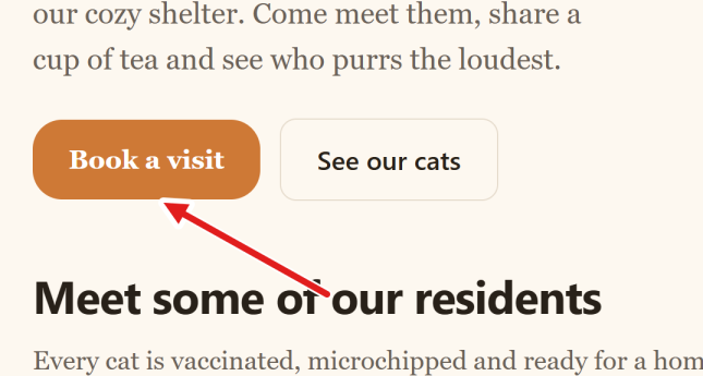
- The button appears where you pasted the code.
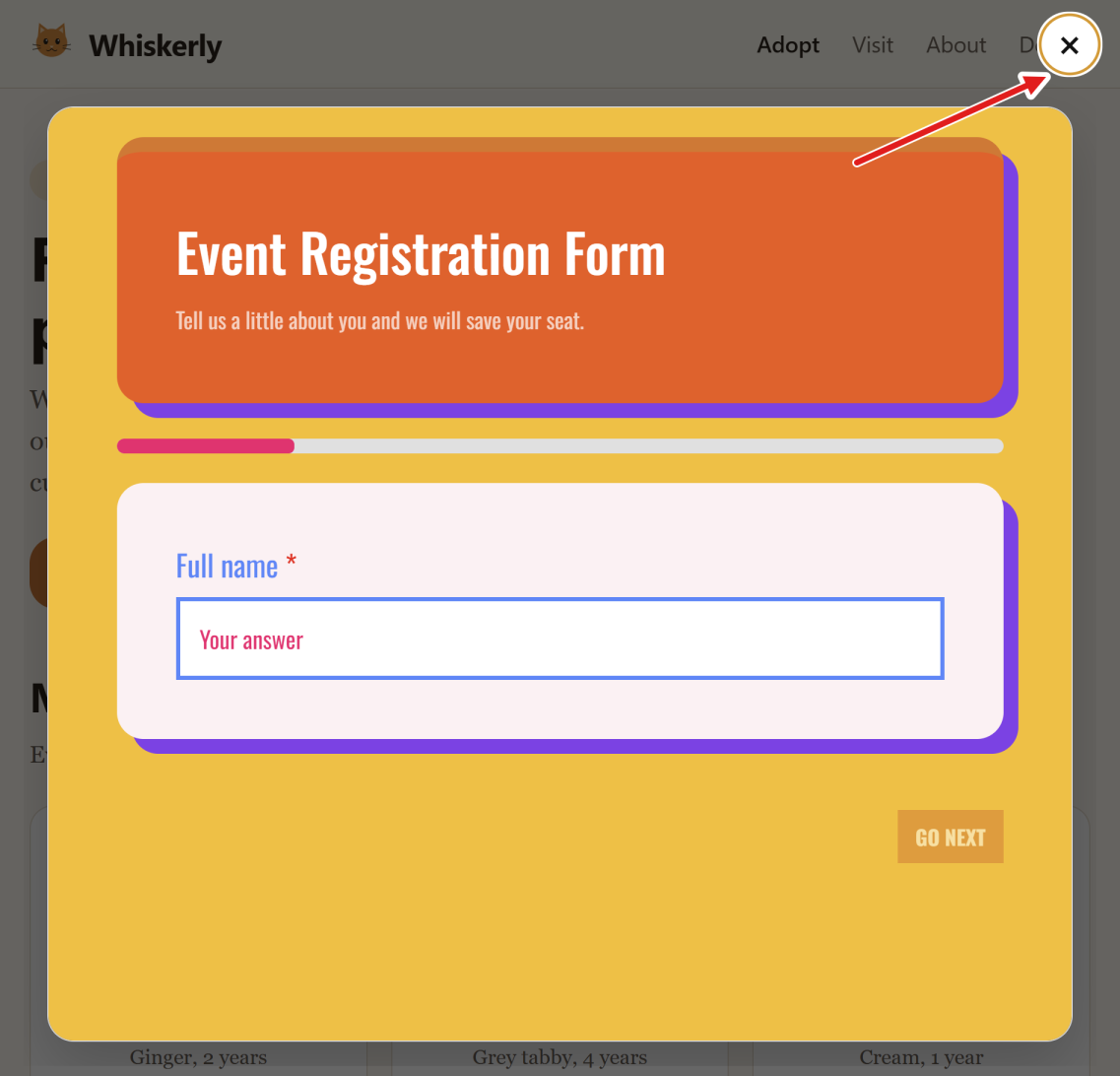
- Clicking it opens the form in an overlay with a dark backdrop, and the page behind stops scrolling.
- A close button (×) sits in the top-right corner. Clicking the backdrop or pressing Esc also closes the overlay.
- If the form is taller than the screen, the overlay scrolls.
- After closing, focus returns to the button, which helps keyboard and screen reader users.
- The form stays loaded after it closes, so a visitor who closes it by mistake can reopen it and find their answers still there. A page reload clears them.
Popup Options
Options are added to the script tag as data- attributes:
| Attribute | What it sets | Allowed values |
|---|---|---|
data-beeform-popup | Your form's link ID (required) | The last part of the share link |
data-label | The button text | Any text. The default is Open form |
data-frame | The frame around the form | none, mac, browser, card |
data-accent | The button and form accent color | A hex color with 3 or 6 digits, without the # |
data-radius | The corner radius | A whole number from 0 to 40 |
data-theme | Light or dark look | auto, light, dark |
The accent color also colors the button itself, with white or dark text, whichever reads better. Here is a popup with a card frame, a pink accent, rounded corners and the dark theme:
<script src="https://beeform.co/embed.js" data-beeform-popup="YOUR-LINK-ID" data-label="Register now" data-frame="card" data-accent="f43f5e" data-radius="20" data-theme="dark" async></script>These options match the embed address options described in How to Customize an Embedded Form. Values that are not allowed are ignored.
More Than One Popup
You can put several popup lines on one page, for example one button per form. Each one needs its own script line with its own data-beeform-popup. You can also use popup buttons and normal embedded forms on the same page.
Tips and Best Practices
- Write button text that says what happens, such as "Book a demo" or "Join the waitlist", instead of "Click here".
- Use your brand color for the accent so the button matches your site.
- The Card frame looks tidy in an overlay. The Mac and Browser frames suit larger screens.
- Place the button near the text that explains why someone should fill in the form.
Common Pitfalls to Avoid
- The button is created where the script line sits. If it does not show, check that the code was pasted into an HTML or code block and that your builder did not remove the script.
- Publish the form first. A form that is not published shows a "page not found" message in the overlay.
- If you want your own button design, use a normal embedded form on a separate page and link to it instead.